The Problem
MindTap is a flagship digital product with thousands of users from hundreds of institutions. A digital platform tasked to represent a future-forward company establishing itself as leader in the field of online learning. Yet, the state of the application was anything but: outdated visual design that didn’t follow established corporate brand, limited functionality, poorly executed interactions; confusing and difficult for students to be fully engaged.
The Challenges
After spending too many painful years maintaining a poorly designed and executed UI of a struggling application, I pushed for the most logical approach: re-work the antiquated system correctly, from the ground up; strip it to the bones and re-think the user experience. But due to budgetary and time constraints (and heavy pushback from the Product team) this approach had to be abandoned; a scaled-down, UI-focused direction had to be taken as the initial implementation.
My first challenge was to identify and map the multiple workflows available to our users, both instructors and students; to document the system’s multiple components and how their functionality helps users in solving their tasks. To help resolve this, the team and I used data from system’s own analytics and research data from multiple user tests to aid in identifying the most common workflows, where to begin and how to cover the most used and useful elements first.
Another major UX challenge was ensuring a simple and usable experience within each primary workflow, while also allowing for multiple variations and edge cases and accounting for user experience variations within internal system components and third-party APIs.
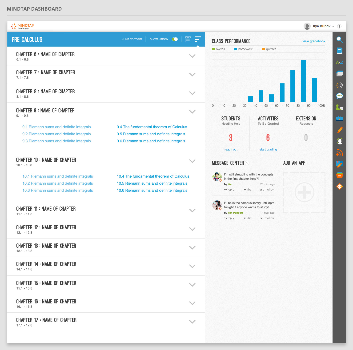
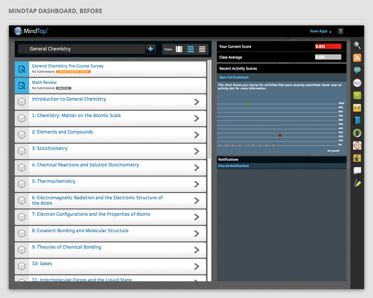
Dashboard, before
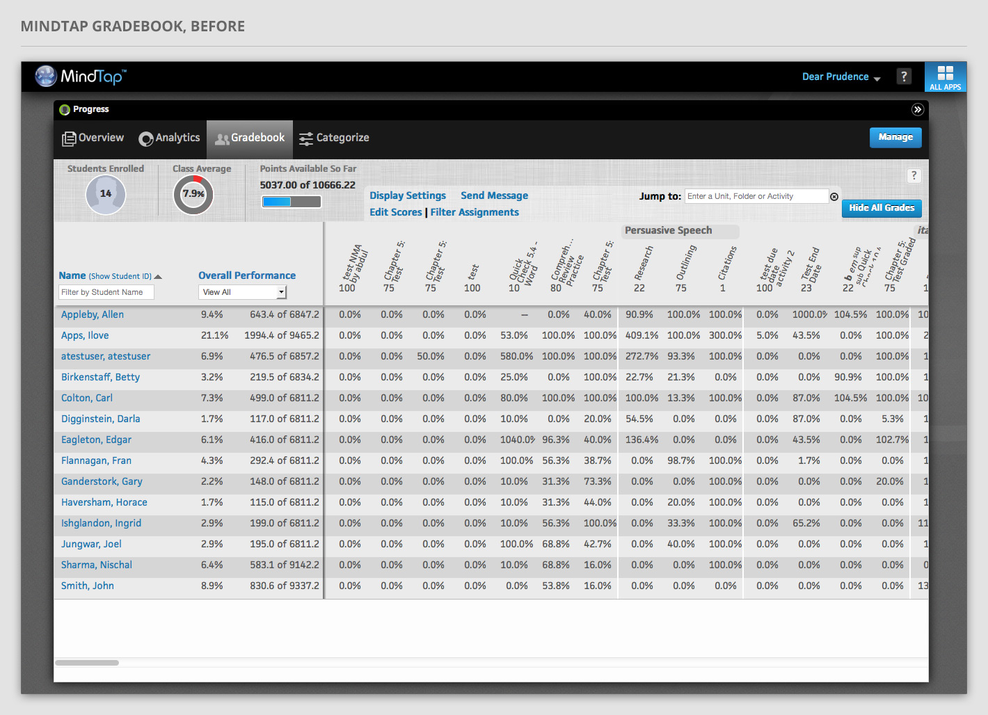
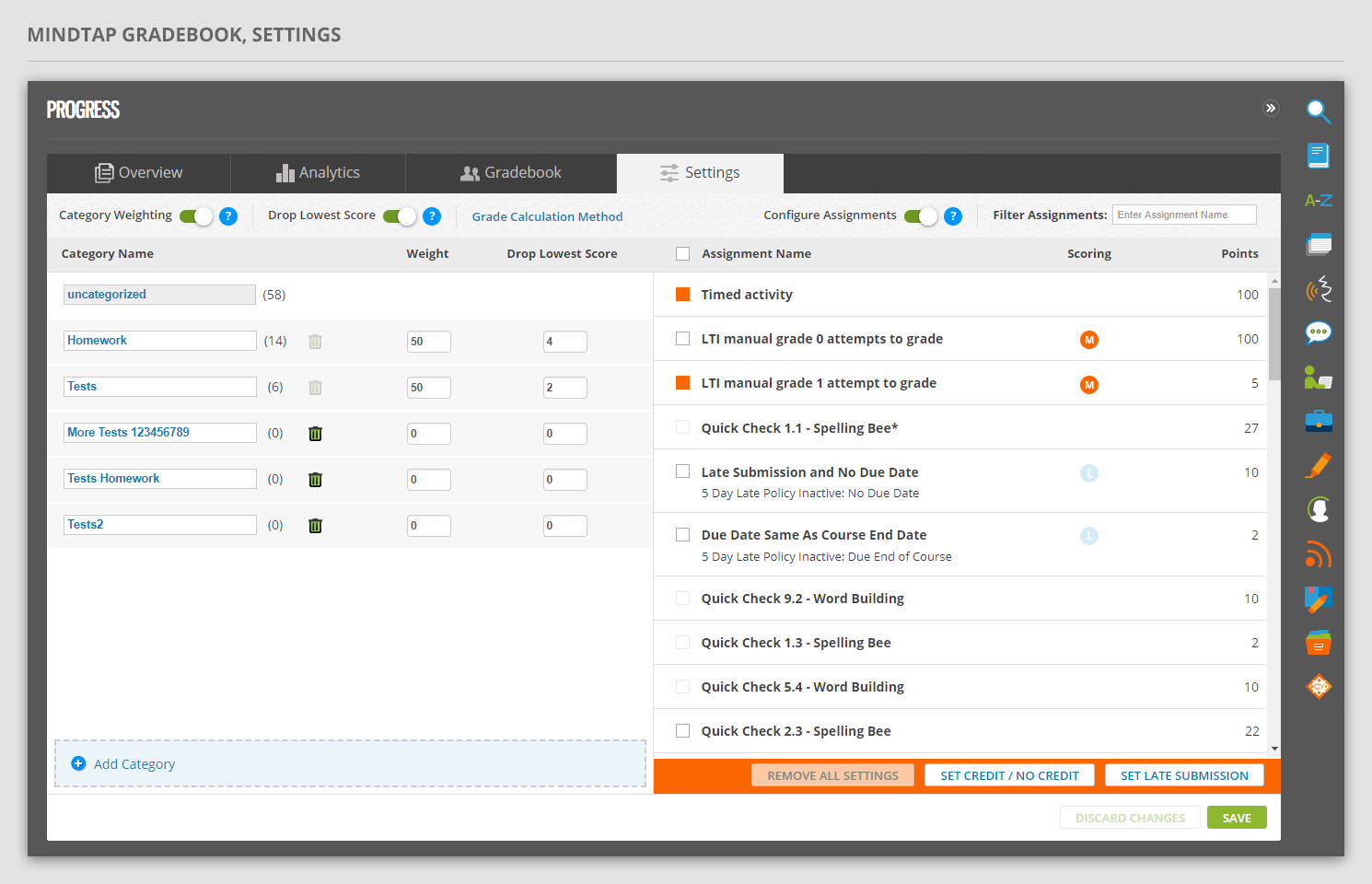
Gradebook, before